


Andy wrote:Here's one for ya. Got it in .svg, too.
http://develop.indriani.net/~andy/media/images/joomlogo.svg
Andy wrote:Here's one for ya. Got it in .svg, too.
http://develop.indriani.net/~andy/media/images/joomlogo.svg
fnamambo wrote:If you thickened up the lines on this one, I think it'd be cooler? Like make the letters all nice and fat and go with round dots?

kenmcd wrote:I really like this one.
What do you think about trying one without the tail on the exclamation point?
Just the vertical stroke.
No need to be symmetrical. May even be more interesting.
This would also push the insides to the right a little. Joomla! to the left.
Have you already tried this?
If you are like me you have already done 50 previous.
I really like this one.


Andy wrote:fnamambo wrote:If you thickened up the lines on this one, I think it'd be cooler? Like make the letters all nice and fat and go with round dots?
How's this?
And the svg.
http://develop.indriani.net/~andy/media/images/joomlogo2.svg
kenmcd wrote:
Scales much better.


Andy wrote:Here's one for ya. Got it in .svg, too.
http://develop.indriani.net/~andy/media/images/joomlogo.svg


kchristoph wrote:mbcweb wrote:my second
I like it very much and I would like to see and feel it on CeBit 2006 in Hannover !
(The next time I have to polish up my English ... The next words I will do in German ...)
In Bezug auf den Namen möchte ich sagen:
"Etwas schade, "joom!" hätte gereicht - Es bedeutet
bei uns so viel wie Geschwindigkeit, Power ... ! "la" bremst die Energie !
DeGrey wrote:kenmcd wrote:I really like this one.
What do you think about trying one without the tail on the exclamation point?
Just the vertical stroke.
No need to be symmetrical. May even be more interesting.
This would also push the insides to the right a little. Joomla! to the left.
Have you already tried this?
If you are like me you have already done 50 previous.
I really like this one.
I liked the symmetry because sometimes I hang upside down from the ceiling when working on design projects and I like to see the same thing as when I sit on this lump of steel they call a "chair". Actually, I tried it without the tail and it just didn't have the same sense of balance. And yes... this is the result of many, many versions


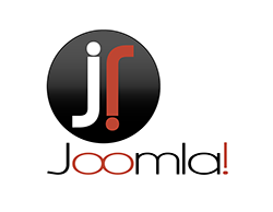
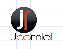
kenmcd wrote:DeGrey wrote:Here is one I have been working on since I saw the new site. Love the color scheme so wanted to stick with the same look. The first one shows the logo by itself. The second shows my guides to show that everything is very specifically placed for a reason (and that I'm anal about good design structure
I really like this one.
What do you think about trying one without the tail on the exclamation point?
Just the vertical stroke.
No need to be symmetrical. May even be more interesting.
This would also push the insides to the right a little. Joomla! to the left.
Have you already tried this?
If you are like me you have already done 50 previous.
I really like this one.
GRutkowski wrote:
DeGrey wrote:Here is one I have been working on since I saw the new site. Love the color scheme so wanted to stick with the same look. The first one shows the logo by itself. The second shows my guides to show that everything is very specifically placed for a reason (and that I'm anal about good design structure

Andy wrote:


serveron wrote:DeGrey wrote:Here is one I have been working on since I saw the new site. Love the color scheme so wanted to stick with the same look. The first one shows the logo by itself. The second shows my guides to show that everything is very specifically placed for a reason (and that I'm anal about good design structure
I like that phi is being taken serious in this design a lot.
would like to see this one with normal "!" (upside down) ...
good work =)
I like the idea of flipping the ! in the second part. Very clever. Would mirror the upper ! in the orb. I'll play with this more later this evening. Thanks for all the feedback so far. A lot of good ideas here!

© 2005 - 2026 Open Source Matters, Inc. All Rights Reserved.


