Page 4 of 37
Re: New Logo
Posted: Thu Sep 01, 2005 10:08 pm
by JoomlaGeek
Re: New Logo
Posted: Thu Sep 01, 2005 10:09 pm
by fnamambo
If you thickened up the lines on this one, I think it'd be cooler? Like make the letters all nice and fat and go with round dots?
Re: New Logo
Posted: Thu Sep 01, 2005 10:11 pm
by unity
If it helps to understand what's needed for a trademarkable logo, you can access the USPTO Design Code Search Manual at
http://tess2.uspto.gov/
Re: New Logo
Posted: Thu Sep 01, 2005 10:12 pm
by kenmcd
Very nice.
When I scaled it down, the j! visual weight seemed light.
What do you think Andy?
Re: New Logo
Posted: Thu Sep 01, 2005 10:14 pm
by Andy
fnamambo wrote:If you thickened up the lines on this one, I think it'd be cooler? Like make the letters all nice and fat and go with round dots?
How's this?

And the svg.
http://develop.indriani.net/~andy/media/images/joomlogo2.svg
Re: New Logo
Posted: Thu Sep 01, 2005 10:15 pm
by DeGrey
kenmcd wrote:I really like this one.
What do you think about trying one without the tail on the exclamation point?
Just the vertical stroke.
No need to be symmetrical. May even be more interesting.
This would also push the insides to the right a little. Joomla! to the left.
Have you already tried this?
If you are like me you have already done 50 previous.
I really like this one.
I liked the symmetry because sometimes I hang upside down from the ceiling when working on design projects and I like to see the same thing as when I sit on this lump of steel they call a "chair". Actually, I tried it without the tail and it just didn't have the same sense of balance. And yes... this is the result of many, many versions

Re: New Logo
Posted: Thu Sep 01, 2005 10:16 pm
by kosson
Nice, nice, nice !

Re: New Logo
Posted: Thu Sep 01, 2005 10:17 pm
by Andy
Holy crap. I just noticed the Dr. Grey image. Looks good, man! Great minds think alike, I guess

Re: New Logo
Posted: Thu Sep 01, 2005 10:18 pm
by fnamambo
Brad,
Stick people expressing their love for one another is NOT defamatory.
Obscene perhaps - tasteless, definitely - and clever, OBVIOUSLY not, humor nazi

But it's not defamatory

My fiancee has now banned me from the boards - she says we'll find a CMS that RESPECTS artististic freedom. Seriously, can't be playing here anymore today.
Re: New Logo
Posted: Thu Sep 01, 2005 10:19 pm
by kenmcd
Scales much better.

Re: New Logo
Posted: Thu Sep 01, 2005 10:20 pm
by Andy
kenmcd wrote:Scales much better.

Oh, it will scale regardless. I made it resolution-independant.
Re: New Logo
Posted: Thu Sep 01, 2005 10:21 pm
by kosson
Power of SVG !

Sodipodi ?
Re: New Logo
Posted: Thu Sep 01, 2005 10:22 pm
by chatfield
This one's cool. Might also look good with a capitol J.
DeGrey: Same thing, cool logo, I'd love to see how it looks with a cap J.
GRutkowski: The logos didn't grab me, but the slogan is right on. I'm afraid a certain sandwich chain might not approve.
Re: New Logo
Posted: Thu Sep 01, 2005 10:23 pm
by MojaveMan
Joomla!
Hmmm...
Joom... Zoom... Boom.... Boomerang... Shockwave... Speed... Action... Motion...

How about something along these lines? This is quick and dirty, I know. Perhaps the text should confer more motion to it, also...verticals being at an angle and/or elongated "oo" for a hint of inertial stretching, etc. Anyone feel free to build on this.
Btw, I know I'm late to the party, but belated contrats to the devs and the community for taking this bold step. That shows action, too! I made the smallest of dents at the old haunt, but I look forward to getting better involved in the future.
Re: New Logo
Posted: Thu Sep 01, 2005 10:23 pm
by Andy
kosson wrote:Power of SVG !

Sodipodi ?
Inkscape.
Re: New Logo
Posted: Thu Sep 01, 2005 10:25 pm
by kchristoph
kchristoph wrote:mbcweb wrote:my second

I like it very much and I would like to see and feel it on CeBit 2006 in Hannover !
(The next time I have to polish up my English ... The next words I will do in German ...)
In Bezug auf den Namen möchte ich sagen:
"Etwas schade,
"joom!" hätte gereicht - Es bedeutet
bei uns so viel wie Geschwindigkeit, Power ... !
"la" bremst die Energie !
I like it mbcweb
!!!!I think: Can you make a little fire at the upper end of
"l" and
"!" ( joom
la
!) .... ?
... or put the world into the
"a" from "jooml
a!
Greetings from Hannover to you!
Re: New Logo
Posted: Thu Sep 01, 2005 10:27 pm
by unity
Can I ask what should be an obvious question here.
As there are 2 O's in the new name, has anyone on the Dev Team thought of approaching OSI with a view to a co-branding agreement which would allow the new logo in incorporate OSI's 'Open Source' logo into the design.
As long as OSI aren't looking for payment for use of their logo then the legalities of this would be that an agreement would have to struck permitting the incorporation of their logo into the Joomla logotype, minus the TM symbol on the basis that:
The right to use the Open Source symbol is contingent on Joomla remaining open source itself - which is not a problem.
There is an acknowledgement of OSI's trademark enbedded in the source code in the same way that copyright notices are embedded.
There is, obviously, and cknowledgement of OSI's trademark on the main Joomla site.
Such an agreement would include a licence to use the OSI logo within a trademarked Joomla logotype without affecting OSI's own trademark rights and vice versa.
This would allow for a logotype which not only provides a clear brand image for Joomla but also clearly brands it as being open source and given the high profile that Joomla should quickly develop on the back of past successes would prove mutually beneficial to both parties.
Re: New Logo
Posted: Thu Sep 01, 2005 10:28 pm
by brian
Thats a very interesting idea and its not one we had thought of.
Brian
Re: New Logo
Posted: Thu Sep 01, 2005 10:29 pm
by kenmcd
DeGrey wrote:kenmcd wrote:I really like this one.
What do you think about trying one without the tail on the exclamation point?
Just the vertical stroke.
No need to be symmetrical. May even be more interesting.
This would also push the insides to the right a little. Joomla! to the left.
Have you already tried this?
If you are like me you have already done 50 previous.
I really like this one.
I liked the symmetry because sometimes I hang upside down from the ceiling when working on design projects and I like to see the same thing as when I sit on this lump of steel they call a "chair". Actually, I tried it without the tail and it just didn't have the same sense of balance. And yes... this is the result of many, many versions

OK, batman.
I turned it upside-down; also did the squint test.
Joomla! still seems too far to the right.
Sorta dangling off the circle rather than visually integrated.
In squint test especially.
I may just be crazy.
Well . . . probably a given.

Re: New Logo
Posted: Thu Sep 01, 2005 10:32 pm
by syabend
my second try


Re: New Logo
Posted: Thu Sep 01, 2005 10:34 pm
by mamboart
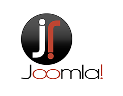
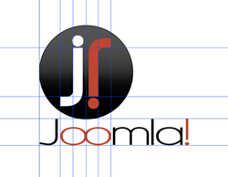
kenmcd wrote:DeGrey wrote:Here is one I have been working on since I saw the new site. Love the color scheme so wanted to stick with the same look. The first one shows the logo by itself. The second shows my guides to show that everything is very specifically placed for a reason (and that I'm anal about good design structure

). The upside down "j" in the orb represents the "!" and the "oo" in the type represents community/infinity.


I really like this one.
What do you think about trying one without the tail on the exclamation point?
Just the vertical stroke.
No need to be symmetrical. May even be more interesting.
This would also push the insides to the right a little. Joomla! to the left.
Have you already tried this?
If you are like me you have already done 50 previous.
I really like this one.
Agree - This one is very much fitting to the website of joomla.org
Re: New Logo
Posted: Thu Sep 01, 2005 10:34 pm
by kenmcd
No having fun!
This is serious.

Re: New Logo
Posted: Thu Sep 01, 2005 10:44 pm
by serveron
DeGrey wrote:Here is one I have been working on since I saw the new site. Love the color scheme so wanted to stick with the same look. The first one shows the logo by itself. The second shows my guides to show that everything is very specifically placed for a reason (and that I'm anal about good design structure

). The upside down "j" in the orb represents the "!" and the "oo" in the type represents community/infinity.

I like that phi is being taken serious in this design a lot.
would like to see this one with normal "!" (upside down) ...
good work =)
Re: New Logo
Posted: Thu Sep 01, 2005 10:57 pm
by greatpixels
Re: New Logo
Posted: Thu Sep 01, 2005 11:00 pm
by barryb
Thought I would give it a shot.........by the way nice logos guys.

Re: New Logo
Posted: Thu Sep 01, 2005 11:03 pm
by starise
Andy wrote:
very very cool!!

Re: New Logo
Posted: Thu Sep 01, 2005 11:10 pm
by tonyskyday
Here's my shot, though i see some people have done similar things now.

Re: New Logo
Posted: Thu Sep 01, 2005 11:13 pm
by mbcweb
new idea


hope it will be taken

Re: New Logo
Posted: Thu Sep 01, 2005 11:13 pm
by DeGrey
serveron wrote:DeGrey wrote:Here is one I have been working on since I saw the new site. Love the color scheme so wanted to stick with the same look. The first one shows the logo by itself. The second shows my guides to show that everything is very specifically placed for a reason (and that I'm anal about good design structure

). The upside down "j" in the orb represents the "!" and the "oo" in the type represents community/infinity.

I like that phi is being taken serious in this design a lot.
would like to see this one with normal "!" (upside down) ...
good work =)
Wow! I would have never guessed the phi would have been picked up on. I see there is fellow design nerd

I like the idea of flipping the ! in the second part. Very clever. Would mirror the upper ! in the orb. I'll play with this more later this evening. Thanks for all the feedback so far. A lot of good ideas here!
Re: New Logo
Posted: Thu Sep 01, 2005 11:27 pm
by guilliam
the INFINITY and UNITY effect has a very good impact(in which i strongly agree we evolve from this concept):

[i]from tonyskyday[/]


). The upside down "j" in the orb represents the "!" and the "oo" in the type represents community/infinity.

). The upside down "j" in the orb represents the "!" and the "oo" in the type represents community/infinity.


). The upside down "j" in the orb represents the "!" and the "oo" in the type represents community/infinity.
 I like the idea of flipping the ! in the second part. Very clever. Would mirror the upper ! in the orb. I'll play with this more later this evening. Thanks for all the feedback so far. A lot of good ideas here!