rsphaeroides wrote:
Sort of an arrow, moving towards the future type thing

i like it!


rsphaeroides wrote:
Sort of an arrow, moving towards the future type thing


cmeister2 wrote:@rsphaeroides: There's something satisfyingly Atari-esque about the second one


mbcweb wrote:my second
mbcweb wrote:my second

 ). The upside down "j" in the orb represents the "!" and the "oo" in the type represents community/infinity.
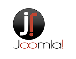
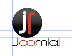


DeGrey wrote:Here is one I have been working on since I saw the new site. Love the color scheme so wanted to stick with the same look. The first one shows the logo by itself. The second shows my guides to show that everything is very specifically placed for a reason (and that I'm anal about good design structure


Just a quick note of caution before folks get too far into things...
Trademarks apply not only to names but also to logotypes and other graphics (think the 'M' arch used by McDonalds)
mbcweb wrote:my second


danialt wrote:well I'm not a designer but here it goes:
© 2005 - 2026 Open Source Matters, Inc. All Rights Reserved.


